
Beauty, Grace & Style
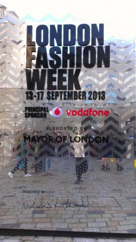
London Fashion Week 13th - 17th September at Somerset House and around town.
In a flash of Vogue Britain's designers showcased their Spring-Summer 2014 collections. I was very lucky to see a number of shows and have some great surprises.
All images are with kind permission of the relevant designers and their representatives. Enjoy!
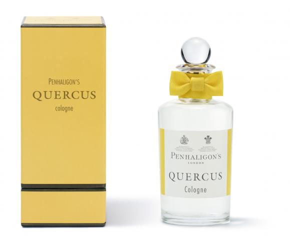
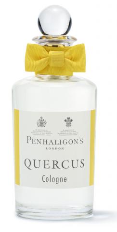
LFW has many leading sponsors including Penhaligon's of London, Perfumers est 1870. The official fragrance sponsoring LFW is the qwerky Quercus. It's bright and upbeat and perfect for Fashion Week.
Bora Aksu
I had a lovely last minute surprise with a ticket to the Bora Aksu show. Bora was ecstatic about having the honour of opening LFW in his tenth anniversary year. Keen to give reflections of his homeland and communicate Turkish themes to a wider audience the "Nazar" collection for Spring-Summer 2014 was inspired by his childhood memories of visits to the Aegean cost.
Bora made a point of using hand crafted Turkish textiles in the Iznik pattern. I particularly thought these looked pretty when incorporated into the designs of dresses. Blue is a key colour and "Nazar" refers to the Eye of Protection bead that he has based the collection around. The collection also uses Fuscia, yellow and off white. I was very taken with the use of textile. Particularly several of the Fuscia dresses that were woven in a netted design. Also the use of quilting and layering in the designs kept that sense of up-scaled traditional design.
This was a great start for LFW and a collection that a lot of people were talking about on day 1. I really liked the music too - dance meets Turkish traditional rhythms.
Pearce Fionda
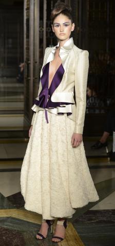
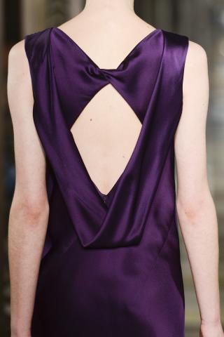
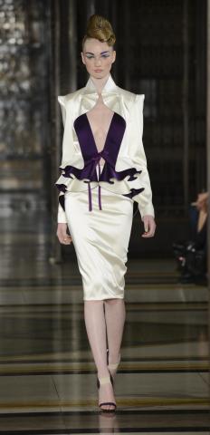
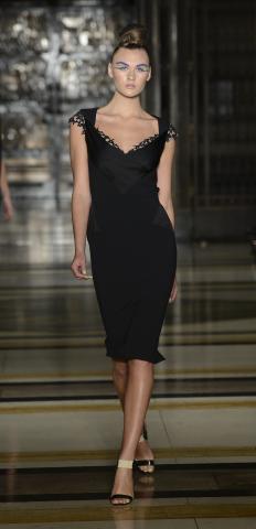
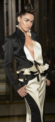
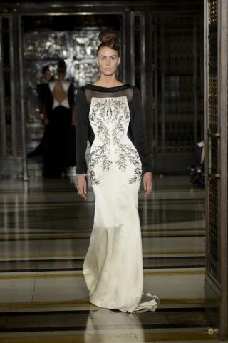
The duo gave a really beautiful demonstration of why Yasmin le Bon and Nicole Kidman amongst others have chosen to be dressed by them. In a very atmospheric setting Pierce Fiona showed a very glamorous evening/occasion wear collection. I was on the edge of my seat for much of the show.
Pearce Fionda are one of London's best internationally known labels. There are a strong series of looks here for public and private occasions that will suit a variety of tastes. This is British luxury at it's very best. It rightly belongs on the world stage.
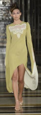
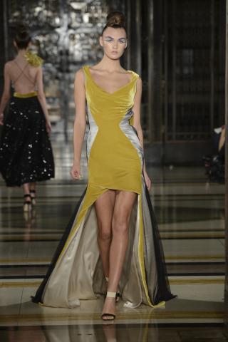
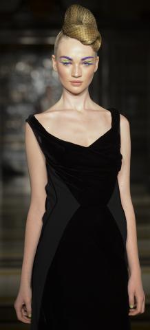
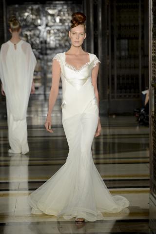
Colour palette opened in monochrome Black and White and also featured regal purple and neutral cream. There are a lot of outfits here that would translate well to the Red carpet straight away. There's huge flexibility in the collection with some of the look more understated than others. Many pieces will capture attention and place the client center-stage. A myriad of different styles to fit with many different personalities.
Jean-Pierre Braganza
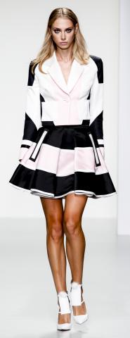
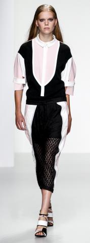
JPB's theme was "Mobius" for Spring-Summer 2014. My eye was caught by the first pieces that came out playing with the contrasts of black, pale pink and white in geometric forms.
Mixing forms and texture JPB also played with the theme of purity using white lace and Broderie Anglaise. Biker jackets added moved the look away from being too young and girly. This is a collection for the woman who is carefully composed but not trying too hard.
Braganza's woman has both a girly side and tomboy-esque. I see that true to his mission statement for the collection the look is of youthful energy with the tasteful refinement of experience . There's a knowing confidence here. These are looks that I can see being worn in London, Paris and globally. It's definitely not trying to be too urban and London-cool. It was a really fabulous collection with huge cheers ringing through
the BFC tent afterwards.


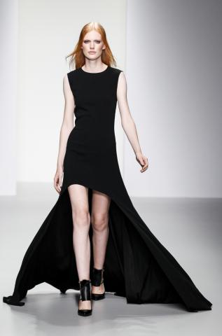
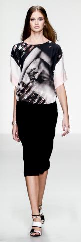


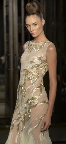
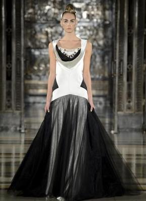
These three dresses were my favourite from the latter half of the collection. To me these are three real screen siren looks. The black dress to the left is fitted with a really fun gently draped bodice detail. The center wedding dress, or occasion dress is a flattering and would look beautiful with a long black coat or wrap. Lastly the Golden Girl in the sheer dress covered in twisting golden vines looks like a primeval deity. Very fun. This is a dress that would bring set the flashbulbs going at a public event and by enjoyable to wear at a private occasion.
Day 2
Zoe Jordan
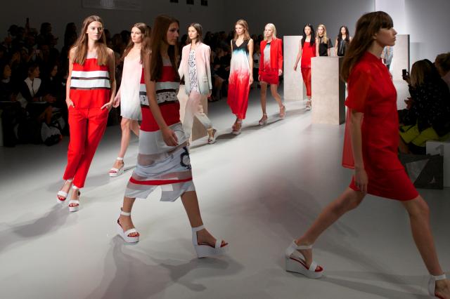
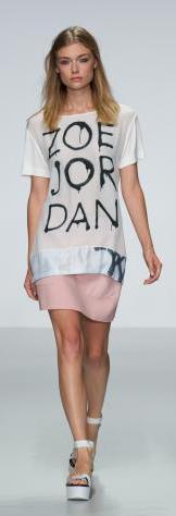
There was a lot of excitement around this collection at the open of day two. Universally liked, Zoe's Skater Girl has grown up. Against a city backdrop she still loves her grafitti prints but a more urbane sophisticated mood has come to her. With light steely blues and greys colours of the city scape, steel and sky. Tweed makes an appearance in a nod to a new-found grown-up elegance.
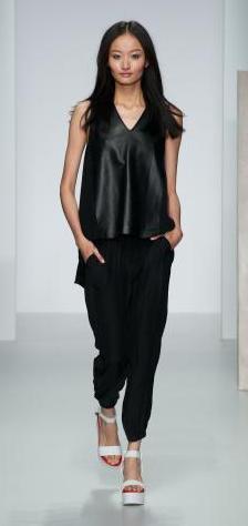
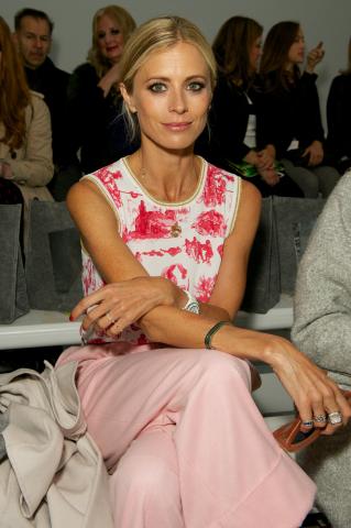
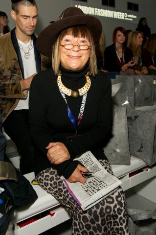

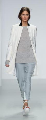

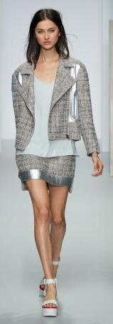

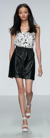

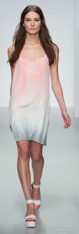
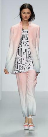
Hillary Alexander and BFC Ambassador Laura Bailey were among the guests admiring the collection and direction for SS14 from Zoe. This was a well received collection a lot of people were talking about around Somerset House.
Zoe uses the structured lines of the city to frame the liquid creativity that she expresses in the collection. It works well adding to the sense of duality between male and female elements.
Masterful tailoring from her hands and always very exciting to see what will be coming next.
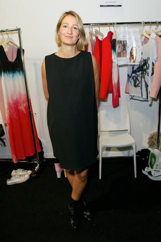
The colour palette is varied from baby soft tones showing a soft delicate side to strong vibrant reds and black. There's a look for every mood here and Zoe still keep true to her theme of sharp cutting and a young new take on the traditions of Saville Row. Zoe is still fantastically combining the structure with loose fitting garments that are uber comfortable to wear. Zoe has been quoted in an interview saying that she wanted to get away from static digital prints and give the collection more speed. This season the 'go faster' stripes are there and she's produced a collection that looks like it is taking a new direction. Here's a picture of Zoe and a great shot of the final walk out at the close of the show.
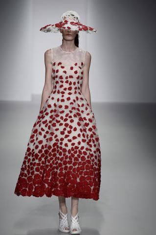
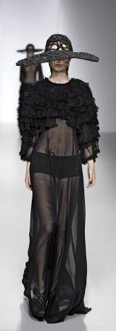
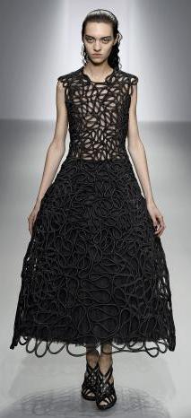
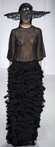
John opened the collection for Spring-Sumer 2014 with dresses that where about ladylike fun in the sunshine. The opening look was a beautiful mid-calf dress detailed with Red-flowers. This look was followed by more strong floral full skirted print dresses. John played with this theme before moving onto his more recognisable Black and White looks.
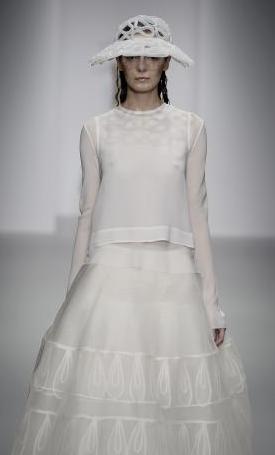
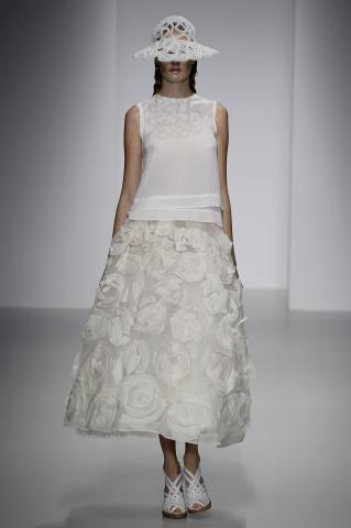
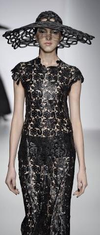
John is known for his cutting, draping and working with textiles. The crochet work and crochet - look made a brief re-appearance in this collection but on the whole he was going in a slightly more sporty direction. Note the long-brimmed vizors of the hats protecting the John Rocha girl from the sun's fierce glare.
John Rocha

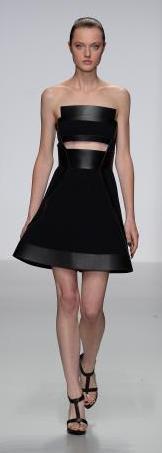
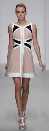
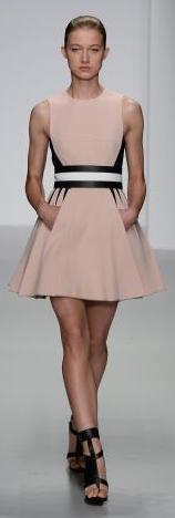
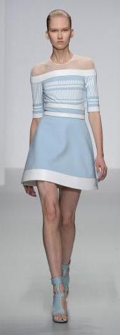
David Koma
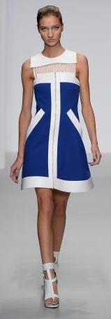
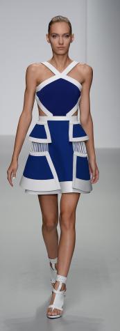
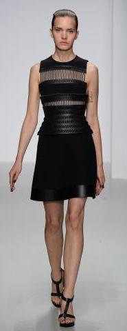
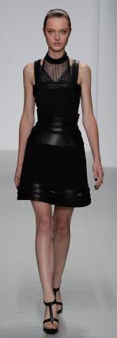
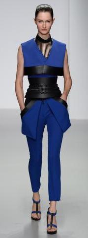
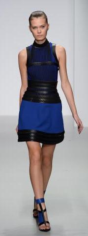
David Koma opened with strong lines with models looking every inch the troop of Japanese Warriors that he drew inspiration from. The collection imbibed the essence of Kyudo. This is an ancient Japanese form of archery that was closely interwoven with meditation with a focus on creating harmony in the inner and outer universe.
The military referencing was evident through much of the collection. The layering became the joining of pieces of armor as it fitted over the models bodies. Cleverly this gives great ease of movement to an outfit to be worn as a fashion and style piece. It's an inspired direction to go in. The two things that drew my attention from the first look where the strong colours and the strength of the design. Empowerment is woven in here not just in metaphor. These are no-nonsense fashion statements. Cobalt, charcoal greys and black and even baby blue all come across with vigor. David has certainly found a lot of scope to explore within this theme.
Strong geometric shapes featured all through the collection. The asymmetric collared jacket featured above uses the idea centered on creating harmony in the universe. Silk and Jersey were used all through the collection to give an impression of a second later of armor. Sheer and stiff organza covering exposed shoulders. A protecting layering lacing Odoshi was made in print.


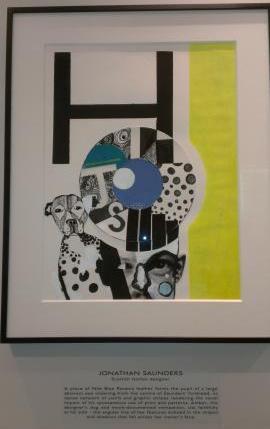
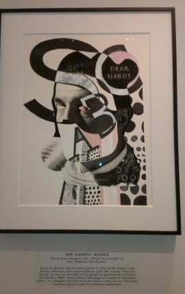
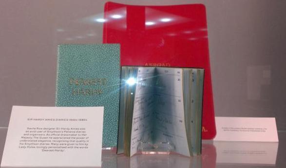
I was very delighted to attend the panama legacy collection show at Smythson in London Fashion week. This season was Smythson's debut on the schedule and in many way's it's were they have belonged in a long time. Here above right you can see as part of their exhibit one of the diaries used by Hardy Aimes, the couturier who's House was located near by in Saville Row.
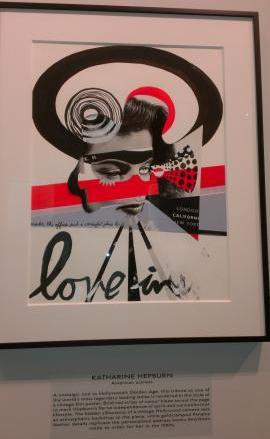
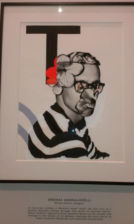
Hardy Aimes had a long term relationship with Smythson. Many artists and writers collect their thoughts and ideas in notebooks and diaries, even in this modern age reflecting David Downton's drawings above these traditional aspects of the creative process are still very much alive, well and absolutely key. As London's lost famous stationer and name known and recognised around the world Smythson should be celebrated in LFW.
Amongst the crowd at Smythson I said Hello to Suzy Menkes as we looked at some of the wonderful artwork by Quentin Jones. The art celebrates some of the well known clients that have been devoted, like countless others to the Smythson Panama Diary. I happily tell you I'm a fan too. True to their modest nature Smythson have found a stylish way to celebrate the 100 year landmark of one of their best selling lines.
Mark Fast
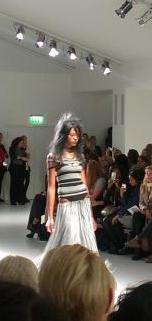
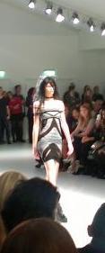
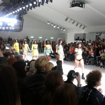
For Mark's Spring-Summer 2014 collection he took an Acid flash-back to 1995 with a lightly Punk-esque feel Fast's girl is a fearless denizen of the mid 1990s Club Land. Mark too was influence by the city-scape and here he is working with bold neon elasto-fabrics to communicate the transmit the flash of energy, ideas and thoughts. My pictures were a little blurry and I'm tracking down some official pics.
Day 3
Claridges - David Downton Midnight at Noon exhibition.
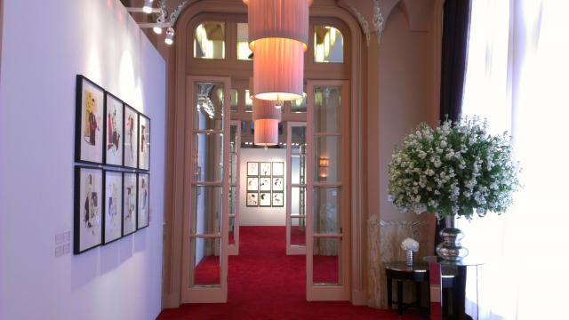
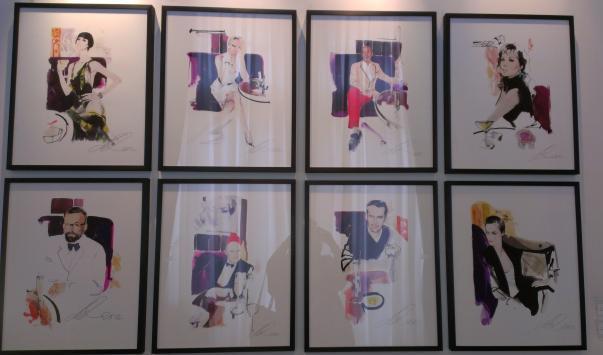
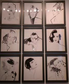
And so to Claridges, that Haven loved and trusted by my family over the years. In a quiet suit of rooms on the ground floor the work of resident artist David Downton was on display to the curious in an aura of beautiful tranquility that you come to know and cherish from this Hotel. It IS different here, Claridges has it's own persona and that's why so many generations have loved it.
I stayed a while and mingled with other guests of the Hotel in LFW and for a few short moments had the place to myself. David will be my favourite fashion illustrator for a very long time. I first met him about 5-6 years ago with Erin O'Connor and he's just cool and brilliant at what he does. He's a great friend of Claridges and a great British talent recognised globally.
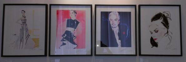
The first two drawings above to the left are of Michelle Dockery, Lady Mary in Downton Abbey. David has talked about the name jokes he gets but I'm really interested in his continuation of working with Michelle alongside Erin with a similar beautiful elongated figure and dark and and hair set on perfect porcelain skin. Perfect for striking a pose Michelle and Erin have the right angles. Next to the right Nicky Haslem, that fixture of the contemporary art, fashion and design scene is looking dapper and every inch the elder statesman of Society taste-making. His pose interests me he looks at David regarding him, seeing him straight on. And then, another great UK/Irish fashion figure known around the world Daphne Guinness. As well as being highly influential in the industry, collecting and preserving the legacy of Isabella Blow and being a devoted mum she's simply stunning. I've been at parties with Daphne a few times over the years and she is truly very beautiful in many ways.
Images in Black and White give and edge of focus on features that are sometimes lost in the deluge of colour. Simple but striking it's always a classic choice. I had a little bounce back from lights above but you can still see who is here. Joan Collins, Sir Paul Smith, Sarah Jessica Parker in a traditional profile, Catherine Deneuve, Albert Elbaz, Dita Von Teese (Ms Sweets), Carmen de la Orafice, Erin O'Connor and Diane von Furstenberg.
All of them guests and friends of the Hotel. Claridges certainly comes up trumps for long term loyalty with only a few other spots like The Wolseley maintaining such a following decade in decade out.
The clarity and definition in the drawings is amazing, you can readily identify who the sitter is because David captures them so well.
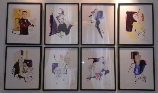
Starting here at the top on the right we have the beautiful Erin O'Connor sipping a Martini (it looks like to me) and relaxing at Claridges. One space to the left and downwards is the milliner Stephen Jones looking dapper in Black-tie, wearing one of his own hats and sitting cleverly in-front of another beautiful artwork by David.
These portraits feel more like action shots although they are static poses. I see a lot of movement and realism in them. Again David captures the essence of the personalities very deftly and produces very lifelike images.
Looking along the top row above we have one of Claridges legendary Bar Team, Lily Cole - looking Divine, Hamish Bowles and Laura Bailey. The latter three both reclining and looking pretty relaxed.
Mark sited his influences as Curt Kobain and Courtney and the American Teen movie The Craft. If you've seen the movie or head the music it's pretty on cue. Reworked into a wide variety of knitted looks Mark hailed this collection as a celebration of youth.
Although he was far from the only designer referencing the 90s this collection had completely the Mark Fast stamp in it so that decade is providing a real fertile field of ideas for next Summer. Within his collection there is great scope in the themes of day/evening and even beach wear.
I really love the idea of the lines and the coloured 'wires' of the fabric echoing the invisible signal and pulse of electro-pop and music. This collection is all about a girl and raw energy pulsing. And as Mark says after the night has passed she's ready to take on the day.
Smythson London Fashion Week Debut. The Panama Legacy collection 2014.
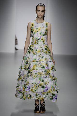
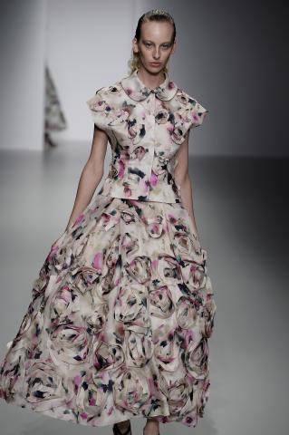
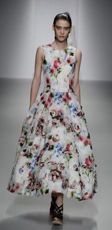
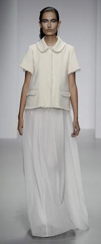
Playing with the white theme here are four great looks with subtle variations. The first look to the left was stand-out for me with the White Rose detail sitting beautifully on the skirt. This and other similarly constructed skirts, as to the right above have a light movement on the figure as they are worn and look classic fairytale John Rocha. He contrasts this neatly with relatively more understated chemises sitting neatly above the waist.
Looking at the silhouette in elongation John looks at the traditional English ladies jacket and brings it up to date with shortened arms to give a light playful cool air for Summer. The two looks center above show a feminine softness. The sheer jacket with rose flower detail complementing the hem of the skirt is closer fitted and shows attention to the lines and contours of the figures. Stripping the Silhouette down in one sense but embellishing it with a profusion of detail.
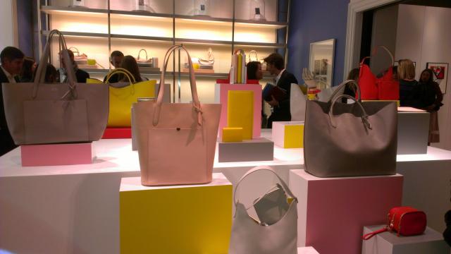
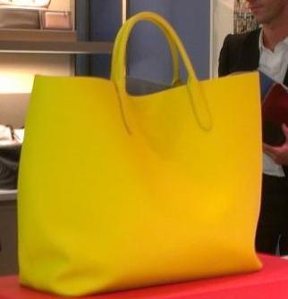
Hillary Alexander was at the party happily chatting away and excited about the collection, she particularly liked the yellow tote featured below. It's very jolly and a very stylish and practical summer bag. In the city or away on vacation you can get a lot into it. It simply looks fun.
Your author in front of Nicholas Kirkwood's sculpture. He said "I've taken elements of my work and designed a pattern that I feel reflects the bold nature and energy of London Fashion Week".
The art-works here celebrate clients closely associated with fashion Hardy Aimes, Katherine Hepburn, Erdem Moralioglu and Jonathan Saunders.
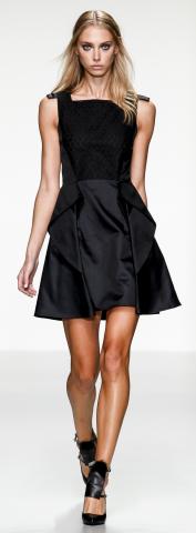
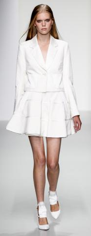
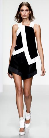
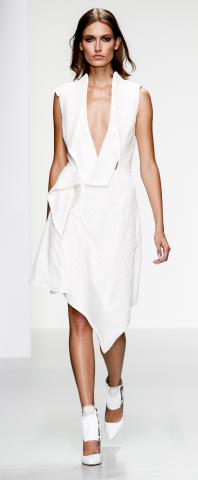
These three pieces take a cue from what I call 'City Chic'. The white jacket and dress combination is very versatile. Without feeling stuffy or over-formal these looks would serve you well for events in the Spring and summer season 2014.
The White Summer dress cut asymmetrically carries forward the nonchalance theme forward.
The Black dress to the far right with it's combination of textures demonstrates the contrasts in spirit that JPB is looking to emphasise with this collection. It echos the Raven of Native Canadian Mythology one of JPB's touch points for the collection. The trickster but also the creator in mythology. What better way to re-invent your look through next year.

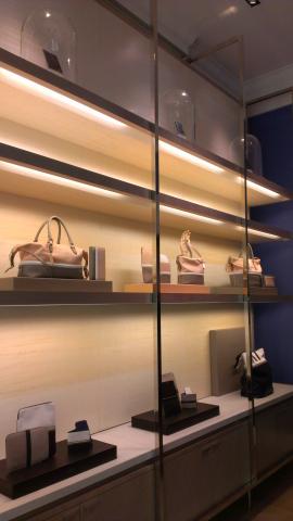
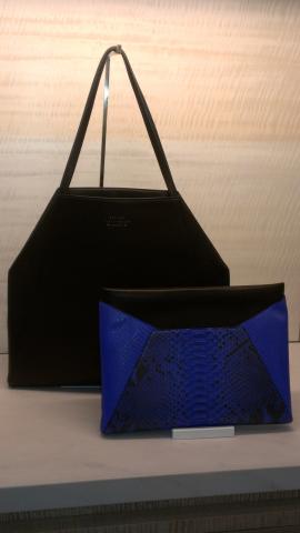
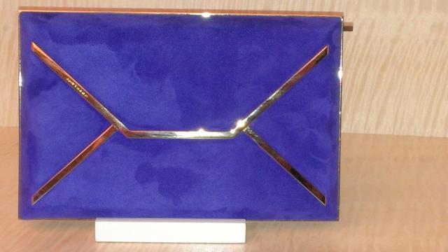
Smythson have brought out a wonderful collection and below left are two more shots of some great pieces from the collection. I'm definitely a fan on envelope design clutches. It's such a great concept. See also a trapeze shaped tote - below left. I think the design is very interesting and looks very snappy. Look out for this appearing through next year.
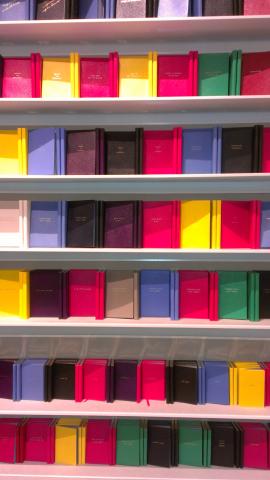
I couldn't resist finishing this piece with a shot of the famous montage of the Smythson notebooks as it's displayed in the New Bond Street store. It really looks like a celebratory installation and all available to purchase.
We were also introduced the the Spring-Summer 2014 collection. A beautiful array of pastels expressing designs of key totes and accessories and a very healthy selection of a number of stationery essentials. There are some great colour harmonies here and I thought the light blush pink and grey contrasting pieces were inspired design.
Penhaligon's Quercus.
Quercus above all is a fun perfume. As we would expect from the House of Penhaligon Quercus is a very sophisticated scent. Notes are blended to precision and the perfume overall is an uncomplicated fragrance that's recognisable and enjoyable.
There's a definite lightness and bounce to it and I detect notes of Lemon citrus that give it that fresh renewed feeling yet never seem sharp. The heart notes of the perfume include Jasimine, Muguet and Cardamon these warm up the Citrus and Bergamont notes and blend with a subtle base of Oak-wood, Sandalwood, Musk and Amber to give a deep warm longevity to the fragrance.
It's genuinley captivating and a superb choice for the official fragrance of London Fashion Week. I would also recommend trying the Penhaligon's Soap in this fragrance. A traditional triple milled English Soap will put an elegant spring in your step every day of the year. It doesn't feel just springy or summery. The warm notes give it that deeper texture that maintain an all year round feel.
This season John has moved forward in working with his materials in new ways. He's given a lace a more updated feel using a new technique of printing a shiny fabric over the lace. This gives a super-smooth wet-look and has the wearer shimmering like a very chic mermaid.The design of the hats as couture pieces is worked using twisted acetate. This cleverly replicates the crochet swirls that we have seen from John in many guises over the years. I spoke with John briefly after his daughters show and he told me no collaborations are in the pipeline between him and Simone. They both have two very strong brand identities and all looks very well at both Houses of Rocha.
Playing with the pastel theme we move into baby blue and pistachio green. There's a very seductive neatness in these looks that quietly draws you in. As a patron there is a lot to like and seriously consider placing an order for, from an artistic stylistic point of view these dresses send the signal of perfection that many people expect from a leading British designer looking to the traditions of the Couture Salon and evoking the traditional atmosphere in which clothes were shown to clients.
These are no non-sense High society pieces, perfect for a Princess on and off duty. There were a number of interesting all-white pieces and I've included four here.
Day Four - London Fashion Week.
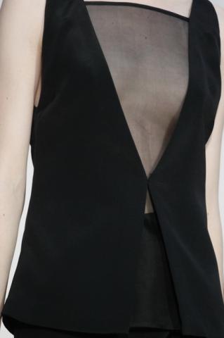
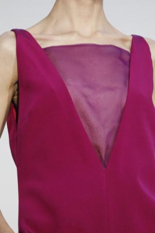
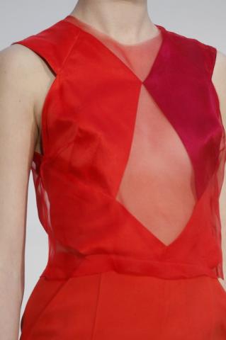
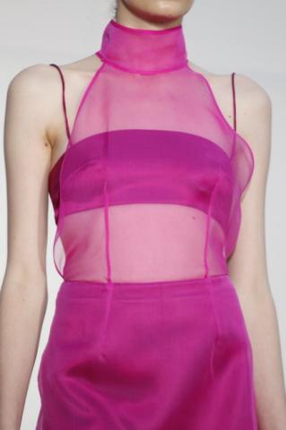
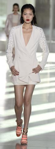
Antonio Berardi
Antonio Berardi had a floral take on
Spring-Summer 2014.
Minimal in places and in others plentiful flourishes of colour and intricate design. Berardi combines a
contemporary sense of grace with ease and flexibility. Berardi's Ready to Wear is another example of British Craftsmanship that leans closely to the standards and traditions the Couture atelier.
Emilia Wickstead
Barbara Casasola
This show was Barbara's debut on the main schedule. Her show at the White Cube was a hot ticket as industry insiders have been aware of her for some time. Barbara studied at both Central St Martins and the Instituto Marangoni in Milan and has been showing in Private Salon shows in London, Paris and her native Brazil for several years. She is steadily building a loyal international clientele. Now based in London with her label launched in 2012 she's a bright new star on the schedule. Barbara has a brand identity that identifies 'her girl' with the simplified style of a society girl in Brazil hosting her first evening occasions. Her reference point is pretty apt for her debut on the show schedule.
Roksanda Ilincic
Roksanda opened her collection with a bright and beautiful colour scheme. Hair tied up in girly bows with feline eye make-up paired up well with the collection's hints of a 1950's-1960s rock and roll look.
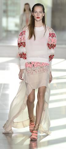
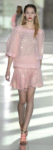
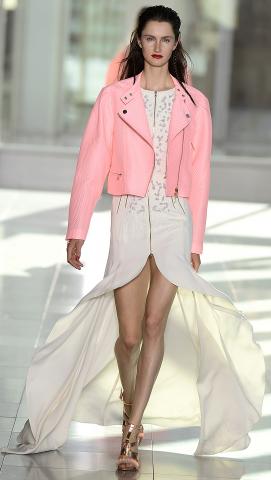
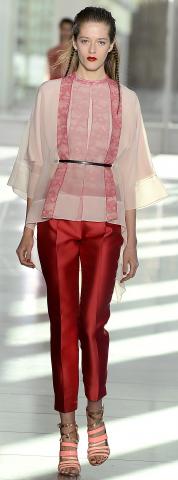
I couldn't resist featuring more of the billowing skirts teamed with two more interpretations form Berardi's collection. Two very beautiful dresses with very intricate detail. The boy-ish sugar pink jacket plays wonderfully with an androgynous idea in a very chic way. All must-have pieces. The next piece hints at a Chinese inspiration with a strong red in the trousers and a light semi-sheer fabric beautifully embellished in Pink's for the chemise. A small high-wasted belt cinches in the waist and echos a tiny obe from Japan. Very pretty and the shift chemise could potentially be worn with other coordinating pieces.
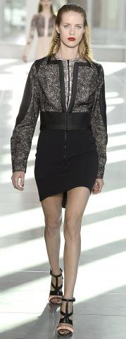
The black jacket and dress combination is very snappy and quite a rock-look that would work well on many different people. Below are some more great looks from the collection, and frankly there were plenty. Continuing with the animal print and skin theme Antonio works through several different colour moods. It's very original and a great exploration of ideas in this collection.
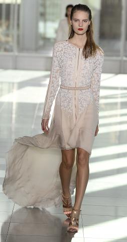
This collection was a very fun exploration of pinks, white and black in many places. If the overall colour palette wasn't broad ranging, what he did with it was. Taking the five looks above there are some great pieces for the day and evening next year here. I love the idea of the billowing skirt-train that Antonio worked into looks here - perfect for catching the breeze on a Summer's day. It's very elegant and gives a fun twist to an outfit. The embellished trouser suit is stunning and the embroidery detail caught the light wonderfully during the show. The next two dresses are modern and sleek and show Berardi is right there at the forefront of contemporary design. These and the sugar-pink crocodile skin-patterned dress that followed drew a lot of eyes during the show. Elegant, sophisticated and very practical additions to the wardrobe.






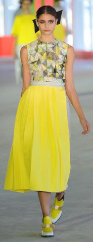

ERDEM
Erdem always draws an eclectic high profile crowd and Samantha Cameron, his long-time champion, was in the front row to cheer him on as he showed the SS14 collection.


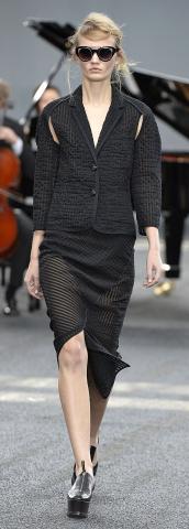


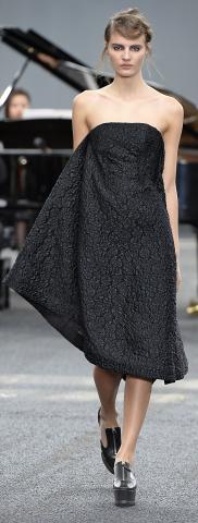


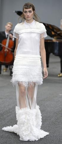


Maria is renown for her work in print and her inspiration for this season's prints were the work of her young artist muse. The brush strokes working and weaving their way across the canvass bringing to life abstract notions of flowers and ink drawing. Maria's print work in it's own right is very interesting as people who have followed her through the years will know.
I saw Emma Thompson sitting not too far away from me and she is one such client who will be aware of the heritage that this collection is based on. However all feels fresh and new. As I watched the show I had the feeling that although this work was clearly masterly it still had the young exciting edge to it that we feel come across from young designers coming up. Maria still has the power to grab and amaze her audience and keep people coming back. Several women sitting around me mouthed 'wow' and 'amazing' as the show closed.
Burberry Prorsum
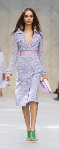
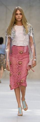
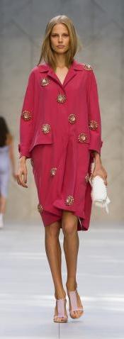
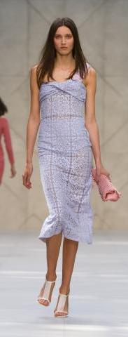
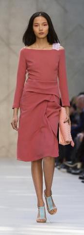
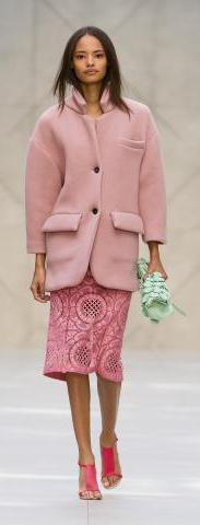
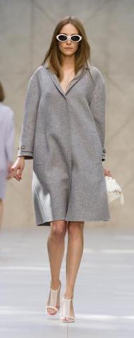
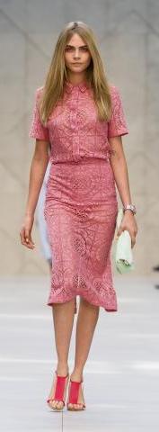
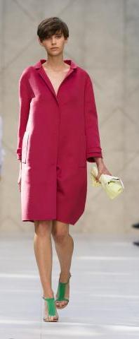
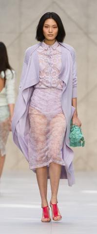
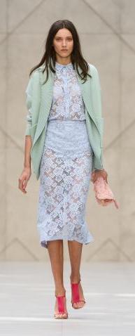
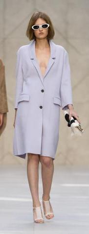
We're all pretty well versed in what Christopher Bailey has done for Burberry through it's gradual re-awakening into a global brand and he just keeps pushing this further and further. Working with a theme of pastels in lilac, blush and deeper pinks, mint green with whites and grey to balance; Christopher referenced many key areas of traditional British textile production in the collection.






Day 5 - London Fashion Week.
Maria Grachvogel.
Spring-Summer 2014 was expressed on an artistic canvas by Maria. She found her muse as a young artist, innocent and creative unaware of her own beauty and enchanting everyone around her with an innocent unselfconscious magnetism.
For his muse Erdem took an American girl who had to dress up as a boy to be able to go to school and study. Falling in love with the great American Classics she becomes a being of romantic sensuousness. There were a few boyish hints in the collection but for me they were drowned in the romanticism that had enveloped his girl. That magical Emily Dickinson poetry had certainly done the trick. The blazers an forms of uniform melt before your eyes into something much more soft.
Yards of organza and tulle created looks that stand on a par with anything that you would find in Paris or any other fashion capital of the world. Erdem's girl is a sophisticated inhabitant of any part of the globe and where she goes her style goes with her.
Be prepared to see these pieces appearing in front of cameras and in party pictures next years. I would certainly have them in my order book.
This is a collection that will draw eyes and orders from around the World and Samantha Cameron did a wonderful thing championing Erdem a few years ago when he first came onto the scene in London.
In Black and White this collection could be somber but it isn't, quite the opposite in fact, it's full of life and spirit and has a great feeling of joy about it.
I thought there was a lot about this collection that felt fresh. Keeping true to the Burberry mainstay of the classic British theme there are a broad range of discreetly elegant looks to chose from alongside some more adventurous workings of fabrics.
I was pretty taken with Christopher's roll-wrap clutch bag that accompanied many of the looks down the catwalk. Complementing and contrasting with several of the looks these grab-able objects are sure to find their way onto many wishlists next year.
The well loved Burberry trench got a new working and this collection used tweed amongst other fabrics to take the theme of the original Gabardine trench further. I really loved the grey coat above which would sit well as a great contrast to many of the pastel hued looks in the collection.
There is also a echo of India in some of these pieces. I picked out the coat-dress to the left from the collection as it reminds me of the vibrant Indian Pinks, sometimes dusky and a little Blush-rose in hue that you see in clothing from that continent. The center of the ornaments of this coat-dress have a mirrored opalescence that resembles the tiny reflective mirrors sometimes embroidered into Indian textiles.
Looking to the right there is a coat that I'm pretty certain will be a big seller next season. These baby pink coats began to appear on the catwalks in some collections last Spring (for this autumn) and now the look is coming across into the stores. I think this will be a look that continues to go strongly through next year and I may pick up this coat myself.
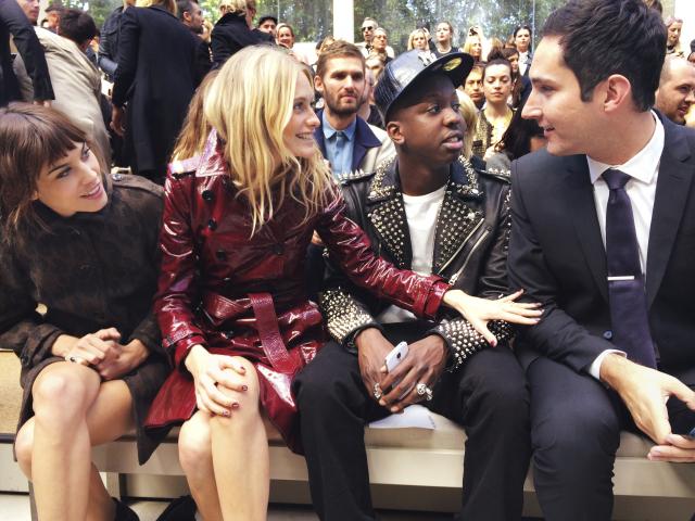
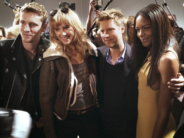
Christopher Bailey has his personal stamp firmly planted here and it's great to see him having so much fun continuing the Burberry adventure in the 21st Century. Another special touch from him was that all guests received an email from him just before the show began to thank them for coming. He goes that one step further to draw you closer into the world of his house. There was a cracking front row including Alexa Chung, Harry Styles and Sienna Miller the current Burberry face. True to Burberry global positioning front row guests had a truly cosmopolitan make-up.
There's a slight bohemian 1970s theme to some of these looks which is so pretty. I think, in part, it's the crocheted lace in varying degrees of sheerness. It's a real county girl look. But as always there is plenty of fun to be had in the city in Spring and Summer and many of these looks would be great party outfits. The coats are take-anywhere pieces that will prove to be a great investment for your wardrobe.
And here's the lady herself in a look from the collection. New this season is the skirt pant. From the front it appears like a pair of trousers but as the wearer walks away you see the flowing silk skirt. It can't be overstated how much the appeal is for her designs that have a feeling of lightness on the body.
The skill in draping is to create outfits that are well styled and look and feel complete but also, to achieve Maria's goal, offer the woman freedom of movement due to the light nature of the fabric.
Maria's colour palette is based in light natural tones. Aqua, plaster, putty and clay form the nucleus of the colour scheme. This is a collection centered on purity and lightness and for Spring and Summer, frankly what more do we look for? Another wonderful collection from Maria.
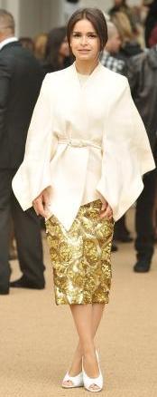
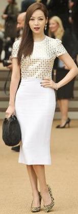
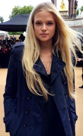
Here below are just a few of the friends of Burberry who attended the show in Kensington Gardens. Anna Wintour, Gabriella Wilde, Mira Duma, Olivia Palmermo and Patty Hou.
Fresh and light here is another mention of the lovely Quercus. I'm now a firm fan of it's light and warm citrus charm and strongly recommend you try it out.
We're slowly edging towards Christmas and Quercus makes a very clever stocking filler as it's gender neutral and pretty suitable for anyone of any age also. That - you have to admit - cannot be said of many fragrances!
The fresh cheery scent will keep anyone zipping around this party season.
Taking masculine tailoring as her touch point Maria works with these basic principles to push further into a new direction creating the maximum amount of lightness and fluidity in her works. This light delicacy is one that is purely female. The masculine becomes the feminine. To work this brand of alchemy Maria uses the lightest fabrics, organza and Egyptian cotton ramie. This allows her to cut with more generosity around the figure but also to keep pieces as light as a feather on the wearer.
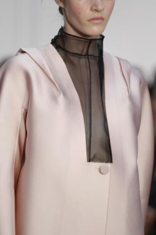
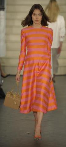
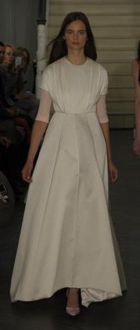
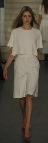
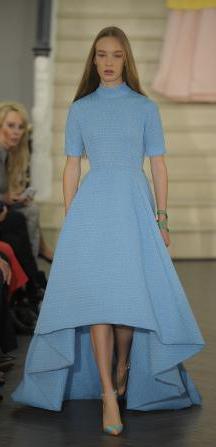
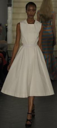
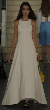
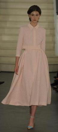
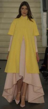
Emilia Wickstead is always very exciting to see each season. Her look is classic but she experiments and plays with ideas in a subtle way. This has won her a loyal and growing international following which makes her a leading British brand who's influence and reach is spreading across the globe.
Here to the right are three opening looks from the collection. Soft colours and gentle shapes envelop the figure. Emilia's woman is a refined lady of taste of any age. She travels, she's immaculate and she's not afraid to be bold.
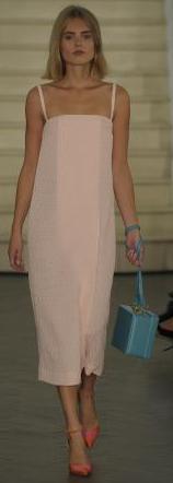
Baby pink is a colour theme that is moving forward through this autumn and into Spring-Summer 2014. It balances beautifully with the sunny yellow in the middle look.
The look furthest to the right above is a really fun day or evening outfit. I loved the play with colour contrast between the pastel pink dress and the blue box-shape bag. I noticed several of these bag designs in the collection and they're really fun. They look like gift boxes! The collection was inspired by legendary society beauties who had a sharp eye for detail and left a strong impression through their style as well as geniality. Gloria Guinness, Marella Agnelli and Babe Paley to name a few. For shows Emilia Wickstead's lady is stepping out with the support of Manolo Blahnik and I have to say it's a fabulous dream combination. Perfect pristine clothes and perfect shoes.
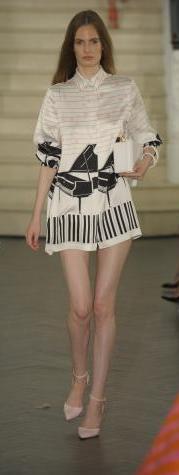
Heading through the collection Emilia gives more new classic looks. It's not a contradiction when talking about Emilia in anyway because this is where she excels. Making new modern classics. To close the look at this sumptuous offering I've included two of the Piano outfits that debuted towards the end of the collection. They are so pretty and such an original idea I had to show them to you. Pretty and cute, as is the rest of the collection. It's serious glamour but there is still a lot of fun here in the collection and it retains a playful bounce for next Spring-Summer.
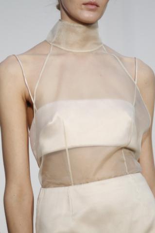
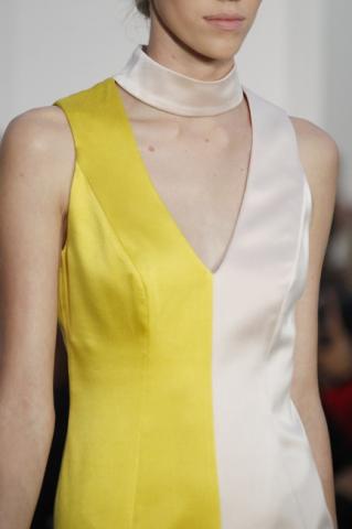
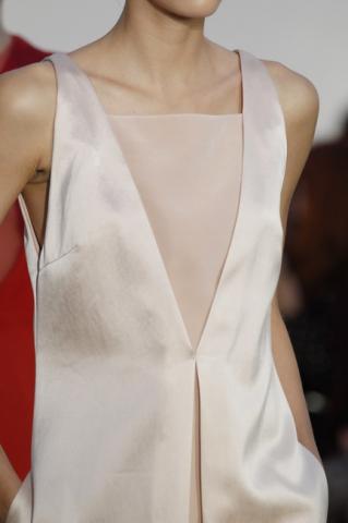
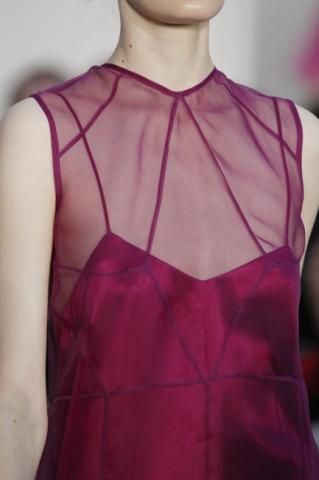
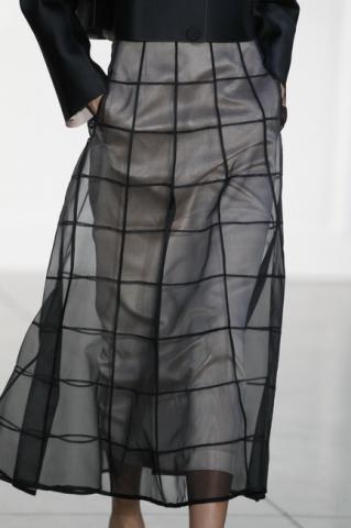
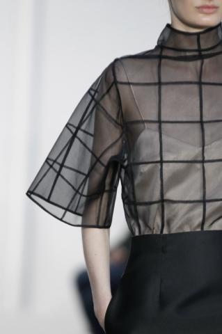
With a reference to architectural design she uses a palette from the Jewellery box. Bright and bold colours give crystal clarity to the looks. It's great tailoring from a gifted young designer with a lot of ideas. Still she kept this debut collection simple and true to brief and produced a number of complimentary looks around her themes.
I'm very taken with the geometric overlay that she places in sheer fabric as the outer-layer on a number of the of the dresses. It gives a sense of the structured simplicity and adds to the lighthearted approach to the young hostesses wardrobe.
There are a lot of wearable well tailored looks here that will slip easily into the wardrobe. The angular cuts give a young definition to the pieces. Barbara chose colours from the Jewel Box to use through her collection. The uncomplicated colour scheme gives emphasis to the tailoring. Barbara's young hostess charmed her audience at her first outing and many people are quietly looking forward to seeing what comes next from her.
Most of all Barbara herself is a delight. With a great smiles and effusive boundless energy, she has a wonderful charm and radiates joy. Hard working, modest and a great talent for the future.
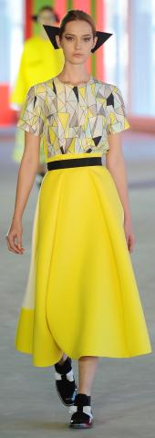
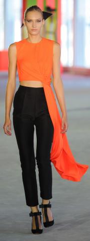
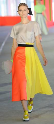
Bright bold yellows, orange and mint green combined with black and interesting tessellated geometric patterns taking this collection in to a new direction for Roksanda.
The colours and the patterning give a lot of energy to the collection. This combines well with a Sino-Japanese theme in the tailoring. The striking combination of the geometric interpretations and the bold colour and texture combinations really grab the attention and prompt you to look more closely at the pieces.
A really interesting feature in this collection was Roksanda's free-style grid patterning that she applied to some of the accessories and outfits. In the look to the left here note the orange clutch with the patterning. Really fun.
I noticed a few of these 'fold-over' clutch bags in the collection and it's a great design. They just seem to fit snugly into the hand or the crook of the arm. Quite versatile, you could wear them at any time of the year.
Here are four great looks that would make great evening wear outfits. Again continuing the theme of bows, Roksanda's girl has sharply cut bows in her hair.
Note down at the ankles the shoes of most of the girls have a bow facing forward. In Roksanda's collection the shoes complement the outfits very well in-keeping with her step into footwear she is providing the complete look.
Roksanda also played with the idea of overlaying her outfits with rock-crystal look stones in square geometric placing. It's an interesting idea that perhaps she will explore more in future.
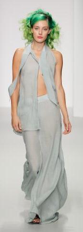

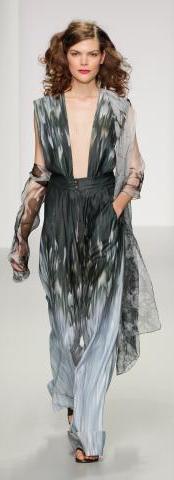

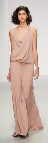

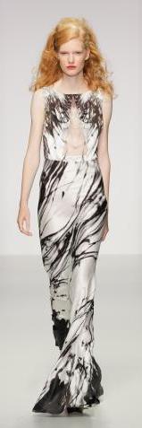
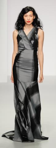
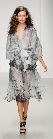


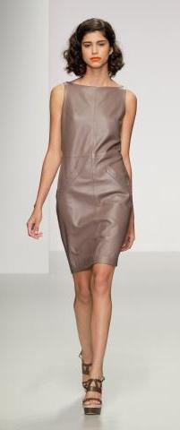
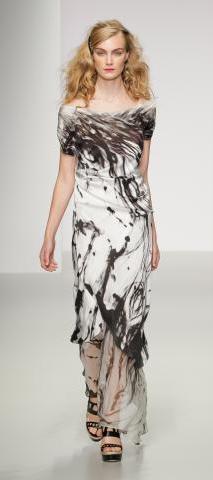
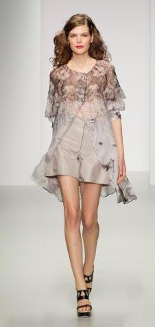
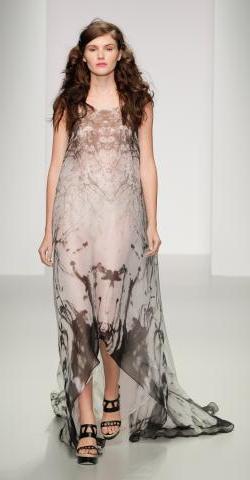
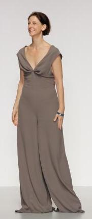
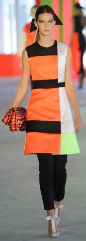

What a stunning series of looks Erdem gave us for next season. Working in a restrained palette of Black and White he conjured a vast array of stylish looks taking you through a day or evening at that special event. Date, Red Carpet Gala or surprise last-minute party, this collection covers a lot of bases. Few people aside from Karl himself can be so versatile and dexterous within the monochrome world of Black and White. It's a masterclass collection.
As with several other designers that I saw exhibit in London during this week, I felt that here was another example of British craftsmanship and tailoring that stood on a par with the Couture atelier's over in Paris. We have many truly fantastic designers in London. Not only are we a hot-bed of creative talent, more and more we are recognised as producing craftsmanship to execute those ideas that is on an equal footing with any that can be found elsewhere in the world.

Simone Rocha
Simone produced a collection that was very beautiful. One of key features that people noted after the show was the pearl lined sash-cut in the dresses at the thigh. Really unique this feature gave a pretty finger print to the collection. Also to note were the detailing around the collars and cuffs.
You can see a lot of thought going into Simone's work and this collection was a young take on prim and pretty high society glamour. Dropped waists featured in a number of looks giving a hint to the 1980s and maybe an earlier era of the 1920s-1930s.
There was a lot of sweet prettiness in this collection that was tempered by the edgy hair styling and make-up of the models to give it a more challenging questioning of authority feel rather than picture-perfect princess.
The show closed with several bridal looks that I really enjoyed for their originality. The veil of the bride was tied around her at the waist and was a blush pink-peach in colour. I can't wait to see what she will bring out next season.