London Summer 2013.
(C) Angela Cliffe 2009-2013
June-July-August 2013

(C) Angela Cliffe 2009 - 2013
Beauty, Grace & Style
Wednesday 12th June saw CHANEL opening their largest store in the world in New Bond Street. Cocos love of all things British grows anew in her sometime home of London's Mayfair.
Her relationship with this neighbourhood outlasted the one she shared with it's owner but she always remained true to her love and admiration of the tradition of fine English tailoring greatly inspired by the traditional modes of dress of the British Upper Set.
The store looks fantastic. In House the Paris-Edinburgh Collection is displayed in rooms that feel like Coco's town house brought up to date. The idea is to recreate what her home of today would look like. It's beautiful but I feel if she where here today there would be other influences around that we couldn't really guess at.
I loved the Metiers des Arts Paris-Edinburgh show last December and loved the elaborate play on history. I think some of the Accessories are pretty interesting and l really love the use of multicolored tweeds. Bold Emerald/Bracken Greens and slightly dusky Fuscia Pinks the colour of the Scottish evening sky make an appearance.
My favourite from these collections has to be the Deep Purple Boucle knit coat and skirt. It just looks so warm and snug.
Another great piece that I really liked is a look in keeping with the Pre-Spring 2014 collection from Chanel. An over-sized Cream coloured cardigan with baby Pink trim quite reminiscent of what went down the catwalks in Singapore a few weeks ago. It looks quite like a Cricket Sweater in with the big chunky knit.
Fashion Rules exhibition at Kensington Palace.
Royal diplomatic fashion of 3 famous style Icons HM The Queen, Princess Margaret and Diana, Princess of Wales.
Kensington Palace is hosting a wonderful exhibit until early 2014 showcasing the style of the 3 women from the Royal family who where (and still are in HM the Queen's case) the most stylish and admired fashion patrons of their time. All made possible by generous support of the Estee Lauder Company.
There is no other family that produced so many style icons simultaneously. Women who not only have the money to buy and commission these clothes but also the look, taste and attitude to seek out and find the best and assemble unrivalled collections.
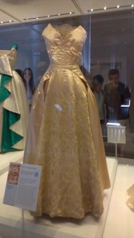
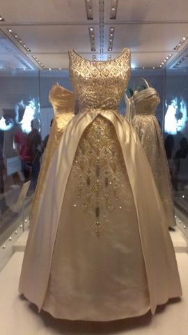
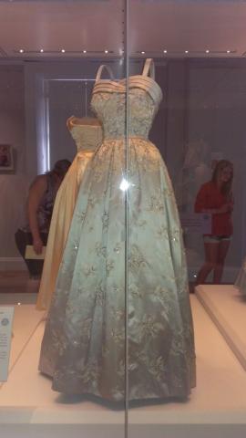
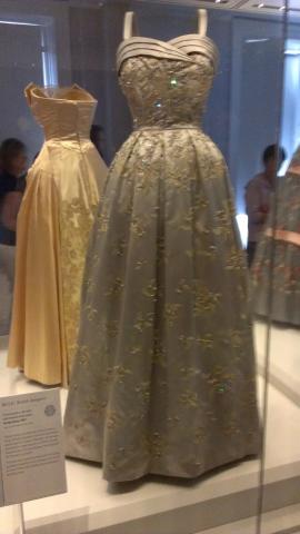
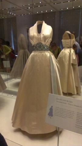
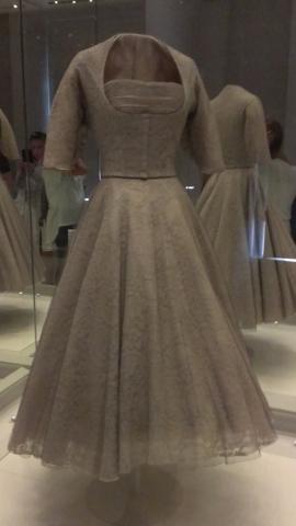
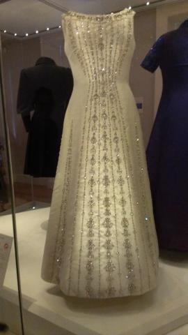
Norman Hartnell's Haute Couture for the Queen.
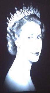
The Wardrobe of Queen Elizabeth II is simply amazing. HM is the most visible monarch we have ever had and her long reign has produced a vast archieve of fashion to look back on. Contemporary and casual, High State occasion wear and Haute Couture. The Atelier of Buckingham Palace has developed in recent years under Angela Kelly to gradually produce more and more of the Queen's clothes but this exhibition winds the clock back to the earlier years of her reign and the gowns that drew the eyes of the world.
The dress to the left in Duchess Satin is a piece you can stand and admire for quite some time. When you see a dress like this up close it's the workmanship that captivates you. I have had huge admiration for the craftwork that goes into Haute Couture since I was small and design and make simple embellished pieces myself. When you look at a work like this appreciating the beauty and mentally thinking through the process of creating it from design to finished product is awe inspiring.
There are literally hundreds of beads and sequins and pearls all with perfect placement.
Another feature of this piece that strikes me as almost unique to Her Majesty and a hand full of other Royal women is the Kirtle skirt that gives the extra layer falling away at the sides. It's often used in Wedding Dress designs and it's a great way to add to the grandeur of the piece. It's something that you would see in dresses from the past and would often, extend into a small train falling gently behind the lady as she moved along. In this garment for simplicity and ease of movement around the room of a modern function, the skirt is simply slightly longer at the back and trails the floor.
I think Ivory Satin has a magical beauty. It catches the light of rooms in the evening in a wonderful way. Especially candlelight. It's a gentle colour to set detailed embroidery against such as is used in this dress. It's also interesting to note that in the new era of Black and White television in the 1950s and 1960s the Queen needed to wear pale, light colours so that she would be seen more easily by her audience than if she was wearing bold colours as these would show as dark on the new television screens.
These four dresses are more examples of the modern sytle of the Queen as she moved forward into the 1960s touring the world and performing Royal duties on the public stage.
Each one is a dream dress. I would say that my favourite would be the one that I've placed nearest above left with the Silver star at the waist band. To me it represents many of the orders that HM gives out. It's an interesting way of working the device into a fashion piece. As you'll see in my pictures the dresses are displayed in such a way that by looking at one you see another or several in reverse.
I think this is a good way to view them as the outfits are stunning in 360 degrees. This is important for a patron who when wearing the outfit is going to be the centre of attention with people in the functions she attends straining to catch a glimpse of her, and what she's wearing and remembering it for many years to come.
For Princess Margaret her voyage into the Fashion World was something different to the Queen's. Just as the nature of her role in the public eye was different to that of the Queen. She could dress closer to the fashions of the time and be a touch more expereimental. She wore clothes that echoed the Pop Culture era and Hollywood Glamour in the 1950s, 60s and 70s. Princess Margaret also often wore bolder coloured outfits than the Queen.
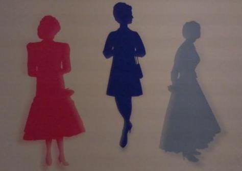
I thought this graphic (above) was a great illustration of the exhibition. Three simple Silhouettes that are easily recognisable.
So lets look at the Fashion Rules themselves, the concepts that gave their name to the exhibit.
* The Hour Glass Shape - The Norman Hartnell Dress (above right in the first row of the Four dresses worn by the Queen) in Apricot Silk.
* Royal Ladies should wear light colours.
* Embellishment. - It's all about the detail. Embroidery and short hemlines. Neatness of Symetry and A-Symetric designed to a T.
* Diplomatic dressing. Using neutral Colours. A military influence.
* Being a Fashion Leader. Becoming a Fashion Ambassador is part of the role of a lady in the Royal Family.
These two above dresses were worn by Princess Margaret. More contemporary than some of the pieces worn by the Queen they look deceptively simple from a distance. Chanel said that clothes 'should make you notice the person'. I've come to understand that Couture pieces with a simplified colour scheme (generally 1 colour in the design) and a plain form draw your attention to the person inside the outfit. You notice more about them, their smile, eyes, glow, hair jewels. All the things that a person may remember about the experience of meeting a member of the Royal family. These are beautiful outfits that serve a purpose.
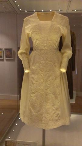
Seen in close-up these pieces exhibit fantastic detail in embroidery, craftsmanship and design. Amongst the outfits lent by Princess Margaret's children, Lord Lindley and Lady Sarah Chatto, there are a lot of different looks exhibited. Below are a trio of bespoke outfits that were worn by the Princess. Each one is a stunning work of art in it's own right.
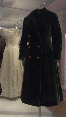
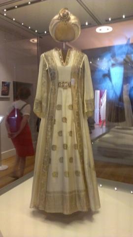
Below left is one of the famous Kaftan's that the late Princess wore. Complete with headdress this outfit is equally as elaborate at the front as at the back. It's a piece with the wow factor and perfect for lighting up tropical nights. The Deep Green military-inspired coat is stunning and I think it's been replicated in many collections in the years since. As well as being superbly cut and finished to me it looked like an outfit that would keep the wearer suitably warm as she went about her duties.
This 1977 Silver Jubilee Norman Hartnell White dress with beaded embroidery is an unforgettable piece. You can almost visualise a White Diamond Tiara hanging in the air over it. Princess Margaret wore it to present an award the Swedish music group ABBA. I think this is the type of dress that many of us would associate with Royal Glamour in the later 20th and early 21st Centuries. A member of the family or any other woman on the world stage could wear it today and it would still make the front pages of Newspapers around the world. In today's age rapid reproduction it would probably also trickle through to the High Street and Ready to Wear in lightning time. It's truly a dream creation. I would love to create a couture dress like it myself.
Lastly we come to the 1980s and 1990s and the Wardrobe of Diana Princess of Wales.
Set in a Magic Circle her dresses are displayed in the round against a backdrop of images of the Princess as we remember her, on tour and giving her best as a public representative of the United Kingdom. There is an interesting quote on the walls from a contemporary Editor at Vogue naming Rock Stars and Young Royals as key figures who gave the real edge to the contemporary Glamour and a pre-cursor to "Cool Britania" in the 1980s.
Whatever you feel about this I think it is true that Diana and her contemporaries in the family did a lot to raise the profile of this small Island around the World and Diana's contribution to raising the profile of British Fashion, and thereby trade and export can not be under estimated. She was blessed with natural British good looks and a good figure and was intelligent in the style choices she made. She had a strong creative understanding.
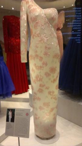
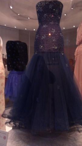
This dress to the far left was designed by Catherine Walker and worn by the Princess of Wales to a reception at the President's Palace in Brazil. It's a figure hugging asymmetric design. Daring at the time for a Lady from the Royal family and perfectly tailored. The flower petals are Blush coloured, a colour that has become popular in collections in the last few years. Carefully avoiding any national colours around the time of a crucial Brazil-Argentina Football match, it's beautifully neutral and timeless. This dress and the probably the Midnight Blue dress next to it could easily be worn today.
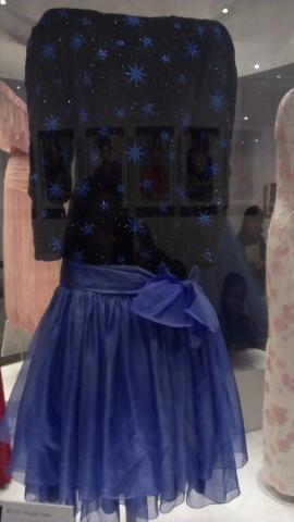
The dress above center was created by Murray Arbeid for the Dinner for the President of Greece at Claridges Hotel in 1986. This Silk Tuille creation decorated with diamante stars was an English Haute Couture Piece created as the equal of anything that could be found in Paris or Milan. This is a dress that should be worn by a tall person and suited the Princess of Wales figure perfectly. It gets top marks for floaty Fairytale Princess effect.
The third dress above on the right was designed by Zhandra Rhodes in 1985. This evening Dress in Silk Chiffon and Satin with beaded trimming was designed to be worn on a State Visit to Japan in 1986.
In keeping with the tradition of symbolically linking the Royal outfit to the occasion it was made for, this dress was created in the Cherry Blossom colour. This Flower is very special in Japan, perhaps the equivalent of the English Rose and at the time of the Royal visit it was in bloom across the country.
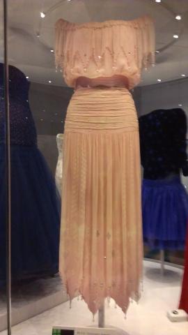
I smiled a big smile when I saw the dress to the right as it reminded me very much of the dresses that my friends and I used to wear to parties when we were little in the 1980s.
A velvet bodace, a sash-ribbon and then skirt with slight ruched detail and a dropped waist. This dress designed by Jacques Azagury in 1985 was part of his 'New Romantics' Collection. The padded shoulders and the Big Bow that ties the sash are all classic Romantic 1980s features of the outfit. This dress was worn on a visit to Italy.
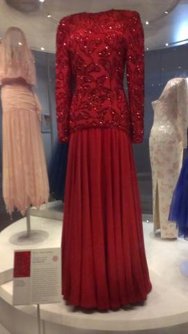
This last dress from the collection that was worn by Diana is a 1986 Bruce Oldfield Creation in Scarlet Silk. With the signature Broad shoulders of the 1980s this is a Power Dress.
The dropped waist complimented the high neckline and broad shoulders of the outfit to create a modest dress concealing the figure. As is the custom of Diplomatic Dressing the manners and traditions of the host country for that trip Saudi Arabia played a key part in dictating the nature and style of the dress.
Bruce Oldfield said that the Princess relied on her designers to create what would be suitable for the occasions that she attended. As Bruce himself said, the designers, of which he was one, didn't let her down and she formed many of these successful business partnerships.
I think it's worth emphasising that Diana wasn't a wealthy Private individual ordering to fill a wardrobe for leisure. She was a working Princess on the public stage and the outfits she wore were to serve a greater purpose. I think she was the right girl at the right time. A fashion figure who represented the UK as an excellent Ambassador with the looks of a Supermodel.
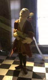
We're saying goodbye to the Palace now and this chap to the left is one of several who are positioned on the Great West Staircase inside Lamps decorated with the Chequer Board theme.
Sometimes being a courtier could be a pretty complicated thing in the past so perhaps the Chequer Board is pretty apt for him to be standing upon.
He looks pretty ernest as he sees the visitors move up the stairs to the apartments inhabited by the George's I and II.
I very strongly recommend that you go and visit Kensington Palace in it's latest incarnation. There is a new imaginative tour that looks at well known characters from a different angle. The Palace is re-inventing itself once again.
CHANEL launch a new 'Superstition' make-up range ahead of Autumn 2013.
All images with kind permission of CHANEL (C).
Diane Kruger, a good friend of the House has made a return as a Face of Beauty in 2013. She has recently launched her third film in the campaign "Where Beauty Begins" and this rekindled relationship between the Model/actrice and CHANEL encompasses and exciting product launch this Summer.
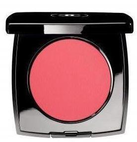
Here below a collage of the colours and trends that appear in CHANEL's new make-up collection launched on 16th August 2013. The Blush compact cases have been re-modelled and are lighter, thinner and sleeker and fit even more easily into the pocket.
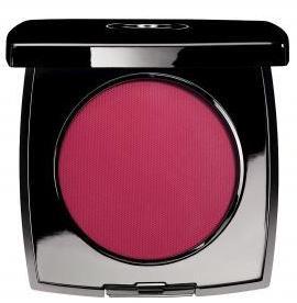
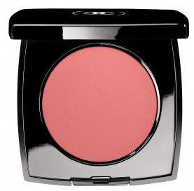
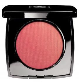
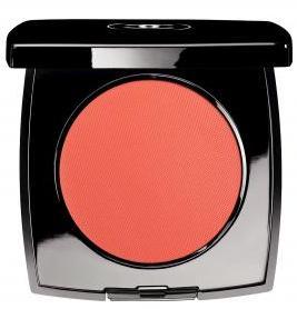
Here below is the colour palette that has arrived at CHANEL counters. From top left to bottom right we have Presage, Inspiration, Fantastic, Revelation and Affinite. These are silky, creamy 21st Century Blushes officially called 'Le Blush Creme de Chanel'. No brush needed here, you apply directly with the fingertips to blend to perfection.
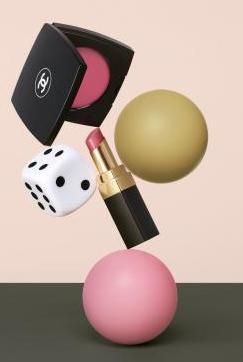
For Chanel the early exchange of ideas surrounding metaphysics and mysticism that she had with her friend Boy Capel fed into a lifelong private belief in luck, fortune and symbolism. For those of you that know her story, you will be well aware that Chanel herself was a passionate advocate of the "Life is what you make it" philosophy.
Her home in Paris was adorned with objects of great symbolic value such Bronze statues of Lions on Bronze and ears of Wheat. The number 5 was always important to her and it was concealed inside a Chandelier in her apartment.
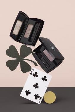
The colour schemes of Bronze and Kharki interact playfully with bright and Fuscia Pinks.
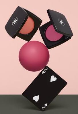
Here to the left is a little scene from the current campaign known as the "Good Luck Duo". I have to say that for me it's perfectly true. If you want to add colour to brighten you face and give you a 'Blush of Pink' about your looks then lip colour and a cream blush are the way to do it. You feel and look even better and then who knows what may happen....'Roll the Dice'.

Some say that 'eyes are a window to the soul'. In this collection the eye of CHANEL's lady is hiding it's secrets with illusion and mystery. When it comes to applying colours around the eye, day to day subtlety is often the best and most practical way to reveal and enhance the natural beauty of your eyes.
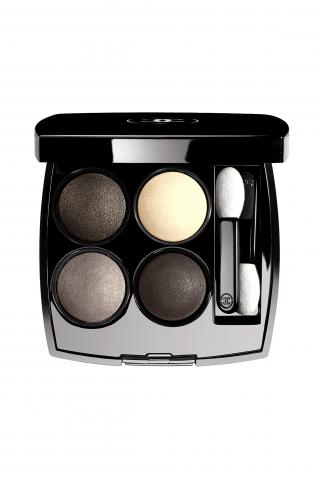
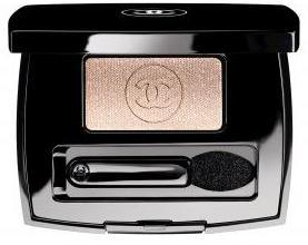
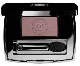
Below, the colours coming through are a mysterious Matte Kharki, a Golden Kharki, a Golden Ivory and a Silver Taupe. The eye liner in Kharki Precieux also frames the eye perfectly when it has been highlighted with this palette of colours.
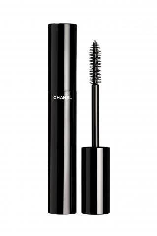
One thing I would also point out is that CHANEL for many years have made some of the best mascara's on the market. The Waterproof ones for me have always held their own against the competition.
There are two new mono's to join the eye shadow collection. A misty Lilac called Hazard and a metallic Taupe called Gri-Gri. These are charming mini compacts that are a pleasure to add to your make-up purse. I first bought Chanel eye shadows after I left School and then, as now, I really love the tiny high definition mirrors in the lid.
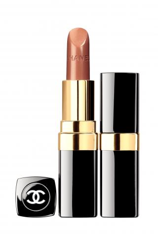
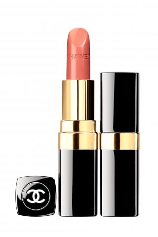
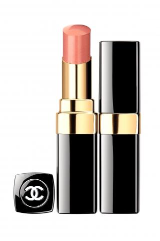
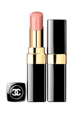
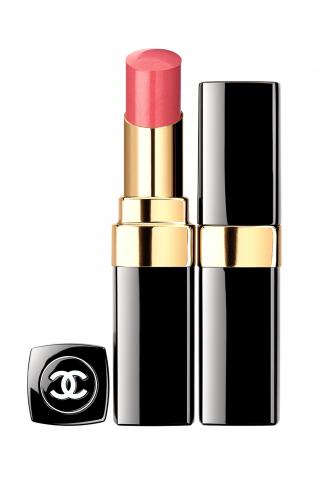
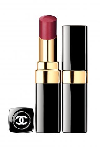
Lip colour always adds such definition to the composition of the made-up face. The Rouge Coco theme of matching lip colours to the Blushes creates a helpful suggestion for the purchaser. Chanel's motto for this part of the collection is 'Smile at Chance' and that is something that I certainly believe in.
The Rouge Coco lip colours have a creamy very light texture and sit beautifully on the lips giving added moisturiser. It's a product that genuinely does take care of the lips as you wear it and is good all year round. With cool months ahead it's a good investment.
I love the shades ranging through coral, honey, Apricot and beige tones. Subtle and sophisticated they give an impression of mystery.
From top left moving right they are Icone, Mystique, Rendez- Vous, Instinct, Secret and Espirit. There are colour here that will suit everyone no matter what their skin tone and that's the benefit of a neutral sophisticated colour palette in my opinion. It is actually more flexible.
Once more playing with the theme of Luck and Chance I love the imagery above of the Blushes and the playing card and the colour globe. To be interested in fashion is to embrace colour and the colour wheel. It may be too fanciful to link the colour wheel to the wheel of fortune but we all find symbolism in different way.
What better way to reach-out and grab your destiny with the new seasonal additions to Le Vernis?
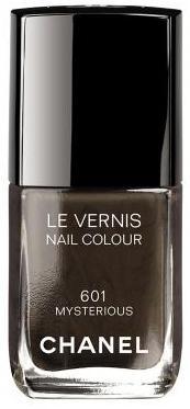
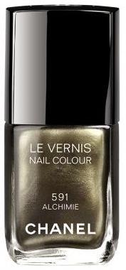
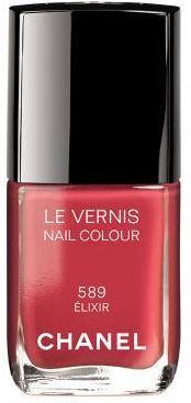
These three new colours are the perfect foil for you talons as you are busy working a little magic here and there. Alchimie, Elixir and Mysterious. These are strong colours for Autumn.
Again like the palette for this collection they are still subtle and adaptable and will suit all skin tones. Alchimie and Mysterious both play with the Khaki theme with hints of Gold and Charcoal Grey. Elixir has a different energy. It's a pink that has a Grey-ish tone when painted as polish.
All of the three colours have a metallic quality which plays with the theme of alchemy and transmutation. This Autumn CHANEL provide the tools for women to transform themselves using luck, chance and magical Savoir Faire.
Be caught in the spell.